Descriptive Analysis Workbook Panelist Mean Graphs
What is it?
Panelist Mean Graphs is one of the sheets in the
Descriptive Analysis Workbook. It is a visual overview of the product intensities for each attribute, showing the panel and panelist means.
Why would I use it?
It can be helpful for initial panelist performance impressions and presenting findings.
Setup options
|
|
|
|
To generate the
Panelist Mean Graphs sheet, under 2. Select Options
, select Panelist mean graph
.
|
|
Analysis Overview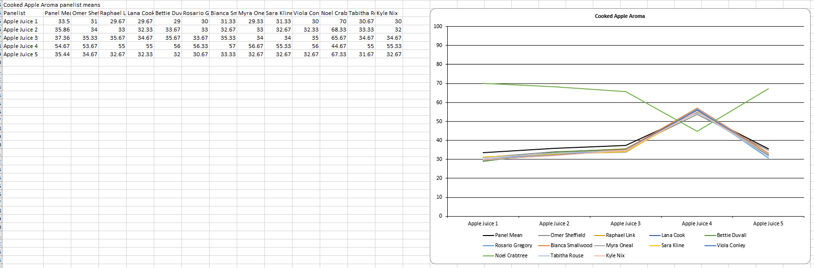
- Graph Data
. The table from which the graph is generated contains all the panel/panelist samples and their means.
- Graph . One plot per attribute showing the panel mean and panelist scores, shown in legend, for each sample.
For more details on panelist information see Panelist Mean Scores sheet.
Example Conclusion
We can see from the panelist mean graph for Cooked Apple Aroma, Apple Juice 4 seems to have a higher intensity than the other samples. We can also see that Noel Crabtree has flipped the scale.